The newest drugstore concealer is Rimmel's Match Perfection Skin Tone Adapting Concealer. This is described as a "2 in 1 concealer and highlighter. Banish signs of fatigue and illuminate the eye area. With an oxygen complex. Lets skin breathe" I should start out by saying that the foundation in this range, "Match Perfection" was a terrible match for me, I swatched it in the store and the lightest shade was far too dark for me, but the concealer intrigued me after all the positive reviews that I've read. I am happy to say that the concealer is quite alright. I picked this up for only $4.99 CAD at Shoppers Drug Mart, it was on sale, I think it's regularly about $8.
The packaging is a squeeze tube, different than the click and apply that most concealers like this have. When I first used it, I was perplexed with how to get the contents out, but then figured out the only way was to squeeze the tube. I am not really a fan of this method because you can't really control how much you get out, and as the end of the product nears, I think I'll be struggling to get contents out.
The brush is like the type that you would find on the YSL Touche Eclat or Milani HD concealer. The product comes out from the centre of the brush and you apply it directly to your skin or on your hand and then blend it with your fingers or a brush. I find the brush fibers a tiny bit scratchy on my skin, when I apply it under the eyes, it's a bit irritating. But this may just be me being super picky.
This product comes in only 3 shades (which kind of sucks): Ivory, Classic Beige and Soft Beige. I have this in the lightest shade cause I am fair (NC15 in MAC for reference). It's a skin colour with some illuminating qualities. The texture is neither watery or chalky, it's creamy and opaque, which I enjoy much about this. I find the coverage is very good, this is a pretty pigmented concealer. It's meant to be a 2 in 1 product, both concealing and illuminating (or highlighting) the area, and I think it does that pretty well. I find that I can pack on quite a lot of this and it blends in well and conceals alright. However, since it contains Talc, I find it can look dry on my skin, which isn't great for under the eyes, an area that I like keeping hydrated looking and not..dry, this is something that I find in most undereye concealers though (including the Hard Candy Glamoflauge) perhaps I just need to moisturizer under the eyes more.
And here it is blended in slightly, you can tell it's close to my skin colour, but a tad lighter. The colour is neither peach nor white, but a good skin colour (if you are pale 010 Ivory should work well for you). It's advertised as being "skin adaptive" I am not sure about that, since there are only 3 shades, and they are all light-medium I am betting those with dark skin tones will not adapt so well to this! Rimmel goes on to say that this product "contains blue sapphire pigments to deliver a fresher colour and an oxygenating complex to let the skin breathe.", not sure about that either, blue sapphire sounds cool though!
Would I recommend this product? It's okay, but since it's a tad drying it's not my favourite. However, the consistency is very nice as I mentioned and I enjoy that about it. If you're looking for a cheap undereye concealer, this may be for you.
Sunday, May 22, 2011
Saturday, May 21, 2011
Baby Pastel Blue Nail Polish Swatches and Comparisons
I love baby blue pastel nail polishes. Recently I picked up the new Essie Burrowed and Blue from the Wedding Collection and wanted to compare it with the rest of my light blue polishes. These types of posts always help me a lot in deciding whether or not I need a polish, by comparing it to other ones that I may already have in my collection, I hope this helps someone!
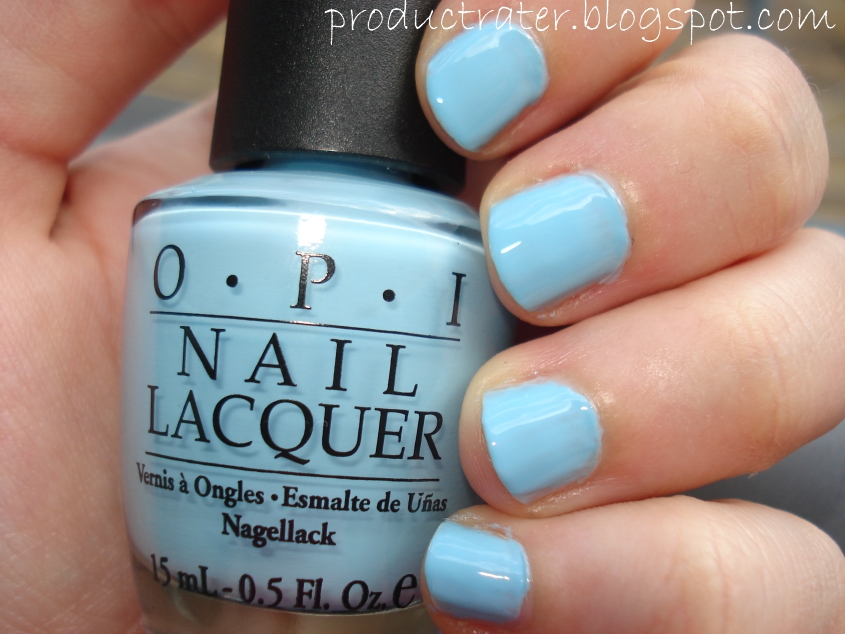
OPI What's With The Catitude came out in the Shrek collection last year. I passed on it initially because I read it was a dupe for China Glaze Bahamian Escape, but as you will see later in this post, they are not the same at all. Out of the four here, this one is my favourite because it applies very well and I love the sharpness of it, it's pale but still pretty bright of a pastel, and I think it looks the best on me.
Revlon's Lilac Lagoon is a new one for me too. I was excited when this came out, but once I picked it up I was disappointed to find out that it has shimmers in it, silver ones (I prefer creme finish polishes). The application on this was not great, I felt the shimmers gave it that grittiness that I don't enjoy. The colour is pretty though, it's a bit lighter than What's the Catitude.
Essie's Burrowed and Blue is the palest blue I've ever seen, this colour is like blue white-out. Since it's so pale, you have to be careful when applying it, if you're like me and messy when you apply your nail polish it can be very obvious. Also notice the left over shimmers from Blue Lagoon here, that stuff is a pain to take off.
China Glaze Bahamian Escape was the palest palest blue that I owned, until recently, and it's actually not that pale now that I've used the others! This one applies like a dream, I find China Glaze polishes are very opaque, with the others here, I had to do coat after coat and this one you can get away with 1-2. This one is perhaps a less "daring" pale blue.
And here they are together, as you can tell Essie Burrowed and Blue is super stark and white compared to the others. OPI and Revlon are close and the China Glaze is definitely much darker, but still in the pale blue family. I would definitely recommend OPI's What's With The Catitude if you can still get it.
OPI What's With The Catitude came out in the Shrek collection last year. I passed on it initially because I read it was a dupe for China Glaze Bahamian Escape, but as you will see later in this post, they are not the same at all. Out of the four here, this one is my favourite because it applies very well and I love the sharpness of it, it's pale but still pretty bright of a pastel, and I think it looks the best on me.
Revlon's Lilac Lagoon is a new one for me too. I was excited when this came out, but once I picked it up I was disappointed to find out that it has shimmers in it, silver ones (I prefer creme finish polishes). The application on this was not great, I felt the shimmers gave it that grittiness that I don't enjoy. The colour is pretty though, it's a bit lighter than What's the Catitude.
Essie's Burrowed and Blue is the palest blue I've ever seen, this colour is like blue white-out. Since it's so pale, you have to be careful when applying it, if you're like me and messy when you apply your nail polish it can be very obvious. Also notice the left over shimmers from Blue Lagoon here, that stuff is a pain to take off.
China Glaze Bahamian Escape was the palest palest blue that I owned, until recently, and it's actually not that pale now that I've used the others! This one applies like a dream, I find China Glaze polishes are very opaque, with the others here, I had to do coat after coat and this one you can get away with 1-2. This one is perhaps a less "daring" pale blue.
And here they are together, as you can tell Essie Burrowed and Blue is super stark and white compared to the others. OPI and Revlon are close and the China Glaze is definitely much darker, but still in the pale blue family. I would definitely recommend OPI's What's With The Catitude if you can still get it.
What's your favourite pale blue polish?
Friday, May 20, 2011
Review: Stila Make Me Blush
Have you ever bought a beauty product just because it was pretty to look at? Stila's Make Me Blush blush is beautiful, one of the prettiest products I've ever seen. I didn't get MAC's Marine Life, but I have read that the colours in this are quite similar (check out NaturalNChicMakeup's comparison post here). This blush came out at the start of the year and was limited edition. Honestly I don't pay much attention to Stila's products, so I didn't get this back then and thought I missed out on it entirely. However, while waiting in line to pay at Sephora the other day, I noticed it, and quickly put back something else that I was buying and got this! It was $18 CAD. The cashier seemed to like it too. :)
This blush has a really sweet and gorgeous heart pattern on it, there are coral/red, pink and peachy-pink hearts throughout. The gold parts are very vibrant, however the gold will go away since it's just overspray. I think it would be cool if a company made a blush like this where the gold goes all the way through.
The gold hearts are the prettiest part of the blush I think, embossed on the hearts are cute words like "I Heart You", "Stila", "XOXO" and "Kisses". I could stare at this blush all day long it's so pretty, I didn't even want to use it, but it would be silly to buy something just to look at it right? At least I think so.
Here are the swatches of the blush, I took a small amount of each coloured heart, you have the peachy-pink on the top, then the pink, then the coral/red, and then the gold on it's own. To the left there is a swatch of all the coloured mixed together. The mixed part is very pretty, it's a peachy coral with a gold sheen, as you use it though, that gold sheen will minimize.
And here you can see how the gold bits wear away over time, half of the gold parts of the heart in the center is all gone revealing the normal colour underneath. Although I do like the gold mixed it, I do like the colour of the blush itself without it, so it's not a huge loss. Although I will try to keep some of the gold hearts intact as I use it, just to keep the original colour of the blush as long as I can.
Would I recommend this product? If you can still find it I would totally suggest picking up this blush, it's too pretty not to!
This blush has a really sweet and gorgeous heart pattern on it, there are coral/red, pink and peachy-pink hearts throughout. The gold parts are very vibrant, however the gold will go away since it's just overspray. I think it would be cool if a company made a blush like this where the gold goes all the way through.
The gold hearts are the prettiest part of the blush I think, embossed on the hearts are cute words like "I Heart You", "Stila", "XOXO" and "Kisses". I could stare at this blush all day long it's so pretty, I didn't even want to use it, but it would be silly to buy something just to look at it right? At least I think so.
Here are the swatches of the blush, I took a small amount of each coloured heart, you have the peachy-pink on the top, then the pink, then the coral/red, and then the gold on it's own. To the left there is a swatch of all the coloured mixed together. The mixed part is very pretty, it's a peachy coral with a gold sheen, as you use it though, that gold sheen will minimize.
And here you can see how the gold bits wear away over time, half of the gold parts of the heart in the center is all gone revealing the normal colour underneath. Although I do like the gold mixed it, I do like the colour of the blush itself without it, so it's not a huge loss. Although I will try to keep some of the gold hearts intact as I use it, just to keep the original colour of the blush as long as I can.
Would I recommend this product? If you can still find it I would totally suggest picking up this blush, it's too pretty not to!
Thursday, May 19, 2011
Review: Make Up For Ever HD Blush
I love Make Up For Ever's foundations, but until now, that was the only product that I ever used from them. About a year ago now, they came out with their HD Microfinish Cream blushes.They are described on the Sephora website as "A cream blush that naturally sculpts and highlights the cheeks for a healthy glow. HD Microfinish Blush combines mattifying and reflecting powders to create a soft-focus effect for a radiant complexion. Its ultra-fine, second-skin texture blends seamlessly, imparting a healthy glow that's hard not to notice." They are also long-lasting, dermatologist tested and paraben free. They come in 14 shades on the Sephora website, I know there are more shades available however.
Tuesday, May 17, 2011
OPI Pirates Of The Caribbean Swatches and Review
To celebrate the new "Pirates of the Caribbean" movie coming out in a few days, OPI has released a new collection of nail polishes. This set came with 6 new polishes plus a Silver Shatter. You won't see the Silver Shatter in my haul here, I am not really a fan of the Shatter thing, it's not for everyone. But I do like pastel hues and so this collection really intrigued me. I instantly fell in love with the seafoam green colour, Mermaid's Tears and picked up a couple more too.
The ones that I picked up were Planks A lot, Stranger Tides, Steady As She Rose and Mermaid's Tears. I actually ordered Skull and Glossbones, but was sent Stranger Tides instead. I thought I would hate Stranger Tides, but I actually don't mind it now seeing it in person. If you are wondering, I get the majority of my nail polishes through NailEtc on Amazon.com. Their prices are pretty good, much cheaper (even with shipping to Canada) then what I would pay at the nail salon.
Planks A Lot is the more vibrant out of the 4 that I picked up, it's a purple, slightly greyed out giving it that slight dusty look, but still a pastel. Although all of the polishes in this collection are cremes, I found this one to be much more watery than the rest.
Stranger Tides is a murky grey khaki green. This one is definitely weird. I don't see myself wearing this often, but I have started to like it more than I thought I would, and it's unique.
Mermaid's Tears is my favourite from this collection. It's a seafoam green. Looking at it in the bottle it's very different than say, a tiffany blue colour, this has much more green in it. I love this because it's a bright colour, but still a pastel tone. This one is similar to Misa's Dirty Sexy Money.
Steady As She Rose is a very pale greyed out pink. This one takes three coats to look opaque and avoid that streaky look that really pale polishes can have.
Would I recommend this product? I really like the polishes in this collection, they have a pale unique quality to them. And if you are into the shatter thing, definitely get the silver one that comes in this collection.
The ones that I picked up were Planks A lot, Stranger Tides, Steady As She Rose and Mermaid's Tears. I actually ordered Skull and Glossbones, but was sent Stranger Tides instead. I thought I would hate Stranger Tides, but I actually don't mind it now seeing it in person. If you are wondering, I get the majority of my nail polishes through NailEtc on Amazon.com. Their prices are pretty good, much cheaper (even with shipping to Canada) then what I would pay at the nail salon.
Planks A Lot is the more vibrant out of the 4 that I picked up, it's a purple, slightly greyed out giving it that slight dusty look, but still a pastel. Although all of the polishes in this collection are cremes, I found this one to be much more watery than the rest.
Stranger Tides is a murky grey khaki green. This one is definitely weird. I don't see myself wearing this often, but I have started to like it more than I thought I would, and it's unique.
Mermaid's Tears is my favourite from this collection. It's a seafoam green. Looking at it in the bottle it's very different than say, a tiffany blue colour, this has much more green in it. I love this because it's a bright colour, but still a pastel tone. This one is similar to Misa's Dirty Sexy Money.
Steady As She Rose is a very pale greyed out pink. This one takes three coats to look opaque and avoid that streaky look that really pale polishes can have.
Would I recommend this product? I really like the polishes in this collection, they have a pale unique quality to them. And if you are into the shatter thing, definitely get the silver one that comes in this collection.
Friday, May 13, 2011
Review: Laura Mercier Secret Camouflage
When I look for a concealer, I primarily want something for under the eyes, I'd like it to be moisturizing, not seep into fine lines and apply easily. Laura Mercier's Secret Camouflage is not the traditional concealer that I normally think of. The texture of this product is quite hard and waxy and if not applied correctly, it can be a nightmare and you will hate it. Lots of people have given this negative reviews because they didn't know how to use it correctly. If applied right, it can provide great coverage and be a wonderful concealer. The Sephora website describes this product as "A dual-tone concealer that completely camouflages dark circles, minor imperfections, and discolorations. This versatile concealer contains a unique two-shade system: one to match the skin's depth of color and one to match the skin's undertone, making it possible for every woman to custom-blend her own perfect shade. The high level of pigment requires very little product to achieve perfect coverage."
Subscribe to:
Posts (Atom)